If you thought you could put off switching your business website to a mobile-friendly platform, we’re sorry to say: Your time is up. Google has made it official: As of April 21, 2015, mobile-friendliness will be a ranking signal, and it could be a huge one.
The Risk
Although this change is primarily an expansion of their 2013 mobile-ranking algorithm, it could have drastic results. In fact, some experts suspect that the fallout from this expansion could be even more dire than that from the Penguin and Panda updates. (And, if you were one of the unlucky websites sucker punched by either of those not-so-fuzzy updates, you know exactly how devastating a 50% drop in organic search traffic can be.)
Long story short: Since this change will affect mobile searches in all languages worldwide, non-responsive websites that can’t deliver a good experience for mobile viewers are likely to get hit hard.
Why, Google, Why?!
 So, why is Google making huge step, especially one that could so radically affect small businesses across the globe? Well, their reasoning is hard to argue because it’s all backed up by metrics that are hard to ignore. Just look at these numbers:
- Mobile already accounts for somewhere between 25% and 50% of all web usage.
- Smartphone adoption is projected to reach 90% by the end of 2016.
- Two-thirds of mobile phone owners use their phones to go online.
- Nearly half of U.S. adults own a tablet or e-reader.
- Over 60% of mobile visitors will immediately abandon a website if it isn’t mobile-friendly.
Obviously, it all comes down to usability. Google knows that mobile usage will continue to rise and that viewers want responsive websites that allow them to easily use and view websites on mobile devices. And, because so many people now have multiple mobile devices, they want seamless integration between those devices too.
The great thing is that investing in mobile-friendly websites has tangible benefits that are easy to identify and for businesses to translate into real dollars. Increased usability on mobile devices nearly always means longer viewing times and higher conversion rates from visitors—and now it will mean better organic search ranking too.
So, What Can You Do?
True, the April 21st deadline is right around the corner, but it’s not too late to get your website updated before it’s hit by some sort of non-mobile penalty. Depending on how old your website is and how it was created, your options are:
- Have your website rebuilt to a responsive framework (if it isn’t already on one).
- Have your website redesigned to integrate a responsive theme or functionality (if it’s already on a platform that is responsive, such as WordPress).
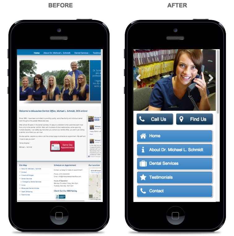
Either way, having your website optimized for mobile viewing will create a whole new (and much better) experience for your mobile viewers. Just look at the difference:
The sooner you act, the less likely you are to feel the fallout. So, if you need a rebuild or redesign of your website to make it mobile-friendly, give us a call or fill out our contact form today.
https://www.business2community.com/online-marketing/mobile-friendly-websites-getting-rewarded-google-now-01180946
https://www.forbes.com/sites/johnrampton/2015/03/19/google-mobile-friendliness-a-significant-ranking-factor/
https://searchengineland.com/google-search-algorithm-adds-mobile-friendly-factors-app-indexing-ranking-215573